Counterintelligence
Here’s your Counterintelligence briefing
Insider insights and smart strategies for nonprofits

Your best donors don’t know you exist (yet)
By Lee Wochner — The audience problem affecting nonprofit fundraising In the 19 years we’ve been working with nonprofits, we’ve heard this question again and again: “Our mission is strong…
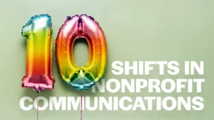
10 nonprofit communications shifts that build lasting donor trust
By Lee Wochner — Today’s donors are informed, skeptical, and values-driven. And they’re paying close attention to how you show up. The organizations that thrive are the ones that communicate…

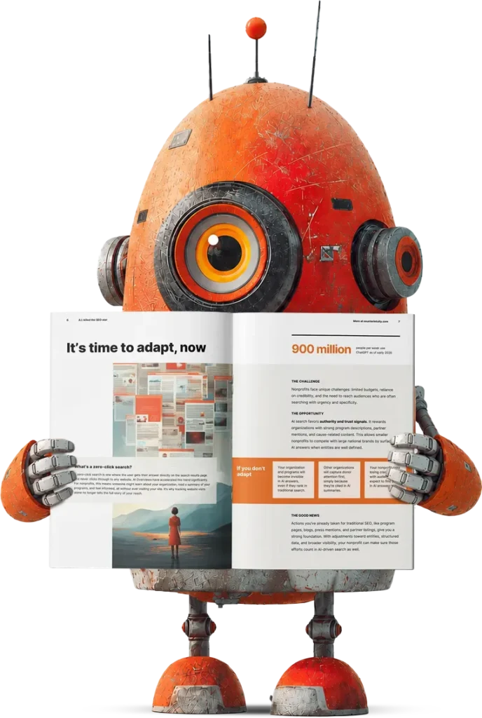
How AI is changing nonprofit marketing (and what to do about it)
By Lee Wochner — Artificial intelligence is changing nonprofit marketing If you’ve noticed a shift, you’re not wrong. Maybe your website traffic is softer than it used to be. Maybe…

Most fundraising problems are marketing problems in disguise
Nonprofit leaders and development directors navigating fundraising challenges know the donors are there. So what’s standing in the way? The marketing problems hiding inside your fundraising results When nonprofit funding…

Nonprofit website best practices in 2026: What to update and why it matters
Nonprofit website best practices have changed more in the past two years than in the previous five. Donor expectations are higher, search algorithms are smarter, and the gap between organizations…

Is your nonprofit ready for a PR crisis? Five things to do now
You may know the feeling. A board member texts you a link to a story with no context. A staff situation that seemed contained suddenly isn’t. A funding partner gets…

Should your nonprofit hire marketing staff or work with an agency?
An executive director called us recently, frustrated. She’d just lost her marketing coordinator — the third person in that role in two years. Now she feared the position would sit…
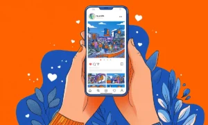
Instagram for nonprofits: A practical guide to social media success
Expert insights from Counterintuity’s social media team on leveraging Instagram’s evolution to reach your goals Social media can feel overwhelming for nonprofit teams already stretched thin. Between limited budgets, small…

Where to use AI in your nonprofit (and where you shouldn’t)
92% of nonprofits feel unprepared for AI. Here’s how to use it strategically without losing the human touch. The smartest nonprofit leaders aren’t asking “Should we use Artificial Intelligence?” They’re…

Website security for nonprofits
This article explains why nonprofit websites are frequent targets for cyberattacks, how the responsibility for website security is divided between hosting and WordPress itself, and what practical, affordable protections leadership…

How to make the most of 2026
Preparing for 2026 is about anticipating social, economic, technological, and policy shifts — and positioning your nonprofit for sustainability and growth. Here are 9 things you should do now to…
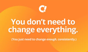
The power of small refinements
How nonprofits like yours can improve marketing and management without a major overhaul By Lee Wochner When we think about progress — especially in the nonprofit sector — we often…

5 ways AI can help your nonprofit do more with less
Your grant didn’t come through. Your part-time comms person just left. And your board just asked, “Why aren’t we doing more on social media?” Sound familiar? The demands on nonprofits…

How to fundraise in chaotic times
Practical steps for taking control of your nonprofit fundraising I recently met the executive director of a nonprofit that has lost 20% of its funding due to a grant that…

6 ways to stay ahead in this economy
No, we’re not in a recession. At least not yet. Consumer spending has stayed about where it was last year, so has Gross Domestic Product, and the Federal Reserve continues…

What AI can do for you (and what it sucks at)
By: Lee Wochner I got my first job, at age 14, because I was already good at using two tools: the telephone, and the IBM Selectric II — a typewriter…

Our go-to accessibility tool helped save a website owner in federal court
The website’s owner, Dr. David Hidalgo, was sued under the ADA — accused of having a site that wasn’t accessible to people with disabilities. A ruling against him could’ve cost…

Are you driving action or driving people away?
Here’s how your nonprofit website can drive engagement and action. Imagine this: A potential donor hears about your nonprofit through a friend. They Google your name and land on your…

The high stakes of neglecting your nonprofit website
Your website is the face of your nonprofit. It’s where donors learn about you, evaluate your credibility, and take action. Yet, many organizations unknowingly jeopardize their success by overlooking essential…
Should you be on Bluesky?
Some social media sites come and go quickly (hello, Friendster, Vine, and Myspace) while others thrive. Adding a new one, or leaving one, requires effort: You’ll need to build a…

The bucks stop here: Fixing donation pages that frustrate donors
“Maybe later.” It’s a dreaded phrase no nonprofit wants on a donor’s mind — Here’s what we mean: A visitor lands on your website, spends a few minutes exploring, and…
Get your Counterintelligence briefing sent straight to your inbox
Insider insights and smart strategies for nonprofits. Spam free.