
Great design stands out because it’s transparent, leaves an impression on its audience, and portrays a message.
…And then there are these gems that portray a unique type of message: design gone terribly wrong (compliments of BuzzFeed). Enjoy!
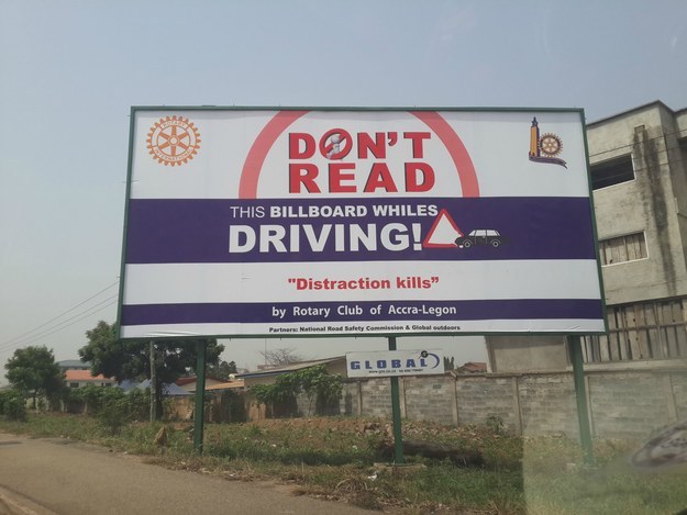
1. This oxymoronic billboard that’s accompanied with grammar errors, too:
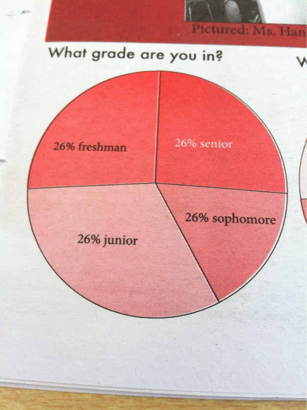
2. This not-so-accurate graph:
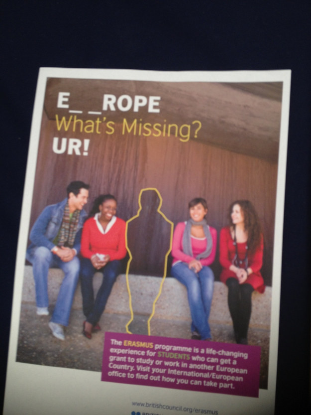
3. This EURROPEAN misspelling
4. This poor choice of font:
5. And (drumroll please), this bird with 2 mouths: