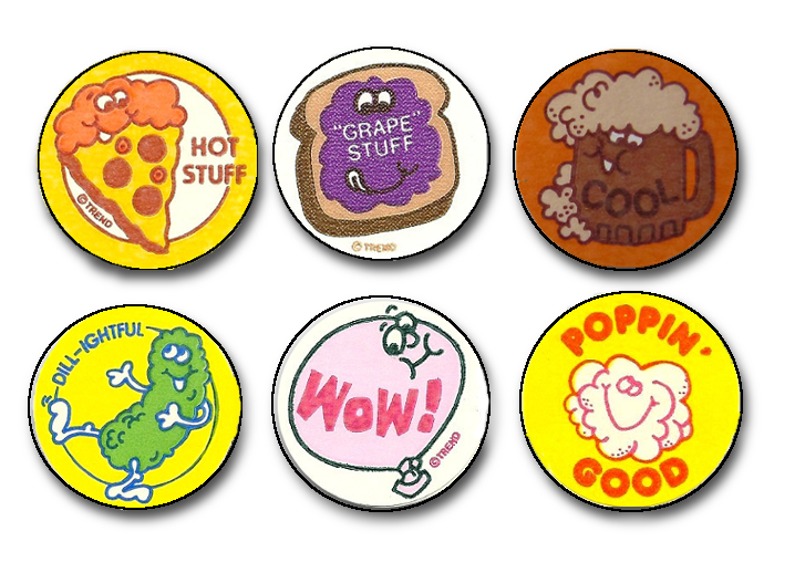
Think of a landing page like a free giant classifieds ad in the newspaper. Except your ad can be more than three lines and have pictures.
A landing page is a goldmine of information – for both you and your customers.
What makes a landing page work?
Here are seven checkpoints your landing page should pass with flying colors:
1. Right at the top in bold clear wording, it tells a customer what you are offering and what you want.
“Sign up and get your free virtual scratch-and-sniff sticker now!”
2. Right along with your beautiful top header, you will have a beautiful stunning image that helps you sell your offer.
Maybe it’s a real-life picture of what a virtual scratch-and-sniff sticker looks like. Maybe it’s just the colors of my flavors that get you happy to click. Point is: It will be so beautiful, you will want to keep reading what’s next on the page.
3. And you will be rewarded! A landing page should next give a nice summary (think elevator speech) of what the offer is.
Perhaps this includes a short bulleted list of 3-7 features on what that offer includes. Keep it simple. People want to know what they’re getting when they sign up. The important question these features answer for the customer is: “Is this product (or service) something that I want?”
Our free virtual scratch-and-sniff sticker is the new future of electronically delivered items—Watch out Amazon!
- No wrapper
- Instant delivery!
- Comes in 5 assorted scents in delicious flavors (Grape, Bubblegum, Lime-tastic, Very Berry and Licorice)
4. It also lists 3-5 benefits that make your product (or service) especially unique.
- Lasting scent through our special e-delivery system – sign up now!
- 100% no flavor mix-up guarantee
- Immediate access to our 300+ flavor catalog
5. You’re on the edge of your seat now, right? You definitely want to submit the form and see what happens next. Let’s close the deal with your Call To Action (CTA)!
Yes, I want to get my free delicious sticker now!
6. Just fill out this form, and click submit.
Note: Make sure your form is just the right length (not a questionnaire), and that it helps you help them. Here’s the form:
- First Name
- Last Name
- Choose my flavor
You can also ask for 1-2 other things that might help tailor future offers like:
- Who’s your favorite cartoon character?
- What country are you in?
But keep in mind that the more fields you ask for, the less chance someone will fill it out.
7. The last part of a successful landing page is a thank you page that re-directs back to your website.
Don’t forget this! This page is often called your “conversion tracking page” and where your conversion tracking code will go, if you’re running an advertising campaign.
Ready to go? You can do it! Just leave us a comment and let us know where we can send your free sticker…


