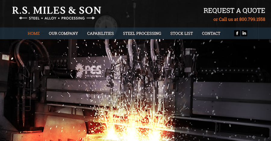
R.S. Miles & Son Corp. has been a full-service steel supplier since 1954, utilizing the latest technology in precision cutting to provide customers with top-notch materials. So it only makes sense for their website to be cutting-edge too, right? That’s what we set out to achieve when tackling this recent redesign.
- Our team wanted to create an “old heritage meets new technology” feel that honored R.S. Miles’ long history, which is why we chose a traditional serif typeface.
- On the home page, sparks (literally) fly in dynamic slider images as the visitor reads about R.S. Miles’ specialties – expert cutting and precise Blanchard grinding, to name a couple.
- A clear navigation bar ensures customers can click right to the information they require.
- Snappy copy keeps comprehensive subject matter interesting. “We’re tough enough to cut steel, but we’re easy to work with.”
- The “Capabilities” section (complete with photos) details past projects and demonstrates client range – R.S. Miles steel works just about anywhere, from military vehicles to amusement parks.
- Contact forms are readily available throughout the website, so there’s nothing holding visitors back from reaching out.
Like what you see? Need a new site of your own? Our contact forms are readily available, too – click here to find out what we can do for you!

