Q: Which is more important: a website’s aesthetics or its functionality?
A: BOTH! The two concepts are inextricably connected on numerous levels.
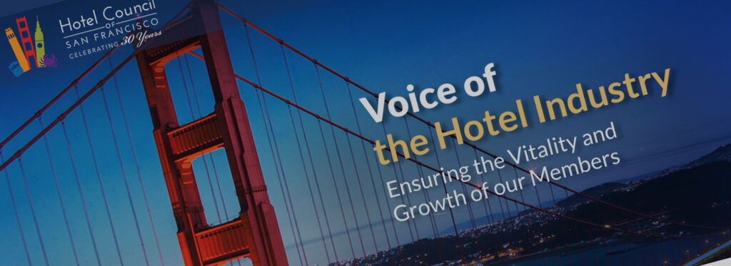
A few months ago, Hotel Council of San Francisco asked us for a transformative site overhaul and their expectations were high. Their new website had to demonstrate the organization’s significant influence in the region with a stunning-yet-user-friendly web portal.
 Here’s a peek into what we delivered:
EXCLUSIVE, EXCLUSIVE, EXCLUSIVE
- We developed a custom, secure membership platform where registration, event sign-up, and payment can all be managed in one easy place.
- Time savings for staff: Not only does this process look great, the improved functionality serves as an immediate benefit to members while reducing the Council staff time spent on menial tasks.
HOMEPAGE, HOME RUN
- Three second rule – Hotel Council’s site passes the 3 second rule: You’ve got about three seconds to engage a website visitor before they lose interest and wander off. Our team listened, and delivered a design to match the timeless beauty of San Francisco.
- Bold wins – With that immediacy in mind, our design team armed this page with bold colors, clear navigation, and a clear value statement, helping guide visitors to their ideal location.
PRO TIP: Take a look at your homepage. Can you tell EXACTLY what your company does in under :03? Now try it with someone who doesn’t work with you. The results may shock you.
Does your site need a functional or aesthetic upgrade? Contact us today to learn more.