Here’s the thing about most modern customers: If they don’t like the way you’re doing business, they’ll take their business elsewhere.
Quickly.
They’ve got high expectations and a whole lot of options – so it’s vital to offer the best possible experience both online and in-store. While reading this Think With Google interview with Deepika Pandey, the Chief Digital Marketing Officer of Walgreens Boots Alliance, we realized she’s got this down – and three key points really struck a chord with us.
- A customer is a customer. According to Business Insider, U.S. consumers are expected to spend more than $630 billion online in 2020. All that money funneling into online purchases means you’re going to lose in-store business. It’s just a fact. The trick is not to treat that as a problem to avoid, but as an opportunity to be seized. Like Pandey says, “Customers who shop in-store and on mobile are 6X more valuable to us than those who shop only in a store.” One of the reasons we at Counterintuity focus on Search Engine Optimization (SEO) and keyword optimization when creating ads for clients is that 93 percent of online experiences start with a search engine – and we want to ensure your customers see you first, even if they’re clicking a link rather than shaking your hand.
- Anticipate needs (and wants, while you’re at it). Only 7 percent of online shoppers believe that brands do a good job of customizing their online experience – but you can be the exception. Walgreens makes it a goal to assist every single customer in the most efficient and effective way possible, and so can you. But rather than simply meeting the customer’s expectations, prompt them to consider needs they haven’t yet anticipated themselves. One great way to do that? Lead-capture forms. Not only do they gauge interest, but Formstack found that an impressive 62 percent of form users get more conversions when they embed a form on their website. And make sure your customer knows precisely what you’re selling with a clear Call To Action (CTA) – not only in terms of copy, but placement and design as well. For instance, a Copyblogger determined that a CTA in button form gains a 45 percent click boost and Kissmetrics saw a CTA within a video get 380 percent more clicks than one in a basic sidebar. Nailing details like these paves the way for a smooth journey from prospect to customer – just how we like it!
- Don’t let gimmicks upstage goals. Remember that super useful lead form we just mentioned? Well, a good way to make it work against you is to make visitors feel like you’re blindly fishing for email addresses. Customers need a clear benefit in exchange for cooperation, or they’re outta there. To quote Pandey (just once more!): “Great consumer experiences should inspire technology, not the other way around.” It was only after Walgreens discovered that its customers weren’t feeling the manual prescription refill system that they introduced Refill by Scan, a technology that enables customers to refill in less than 20 seconds and turns the process from painful to pleasant. In that same vein, we never offer our clients services they don’t need – and we don’t recommend that they buy into fads, either. People appreciate authenticity, so don’t get too caught up in trivial tech trends. Determine what you really need to do to streamline your user experience and make it happen.
Remember, it’s not about online vs. in-store – it’s about making the two aspects of your business blend together to create an unbeatable overall customer experience. When in doubt, ask two questions: WWWD (What Would Walgreens Do), and 2) CCDIY (Can Counterintuity Do It for You). Pro tip: the answer is yes, we can.
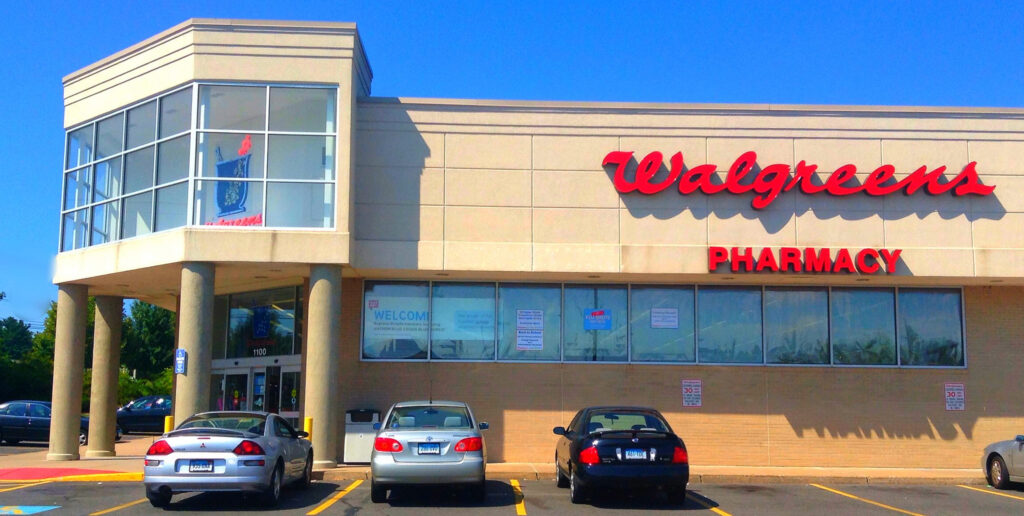
Image by Mike Mozart is licensed under CC BY 2.0

