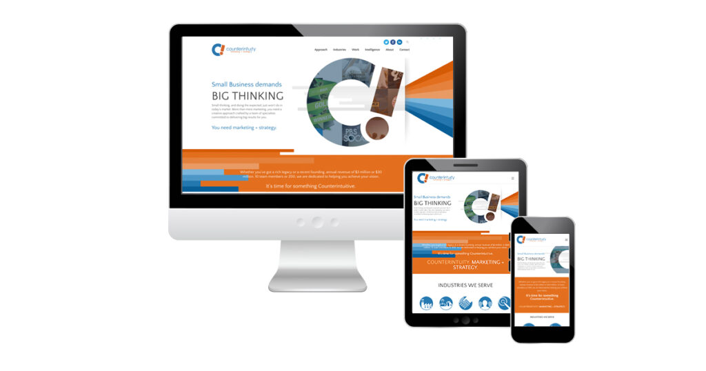
At Counterintuity, we spend a lot of time strategizing.
Whether we’re brainstorming an ad campaign or perfecting a home page, we’re constantly concocting new ways to maximize our clients’ potential. So when it came time for our own website redesign, we knew exactly what we wanted – and how to make it happen.
On Your Mark(et)
We tell our clients all the time: know your market, and target them accordingly. What’s our market? A company earning between $3 million and $30 million in annual revenue in the manufacturing, industrial, nonprofit, e-commerce or professional services industry. Our ideal client is established in their field, but still has plenty of room to grow. We wanted our website to make it abundantly clear that we’re eager and equipped to partner with companies of that caliber, by leading with strategy first – so we strategically placed that message on our home page.
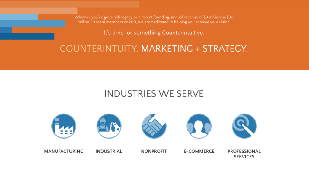
Hard to miss, right?
When a potential or current client visits our website, we want them to see what they’re signing up for. And we want them to be happy about it, too! That’s why, in the past, we emphasized our excellent design work. Don’t get us wrong: That’s still a major highlight, and we made sure our portfolio was fully updated (more on that later), but first we wanted to back up all that beauty with some data.
Featured Facts
Our clients have been doing well – really well – and when we make a statement like that, you’d better believe we’re going to prove it. We made a point of requesting testimonials, tracking our clients’ successes and presenting the statistics via in-depth case studies.
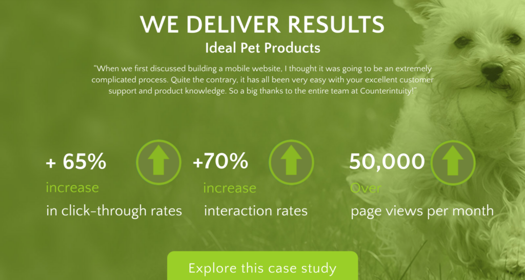
For example, by strategically marketing to Ideal Pet Products’ target customers through social ads and email newsletters, we positioned Ideal Pet to get even more of their ideal customers to its newly launched e-commerce site – and they thanked us for our “excellent customer support and product knowledge.” Now who wouldn’t want to brag about that?
Visionary Visuals
Like we said, we’re extremely proud of our designers and their fantastic creations. Irresistibly clickable websites, colorful annual reports (like PBS SoCal’s, pictured below) – you name it, they nail it. So we made sure our portfolio reflected the breadth of Counterintuity design, both print and digital.
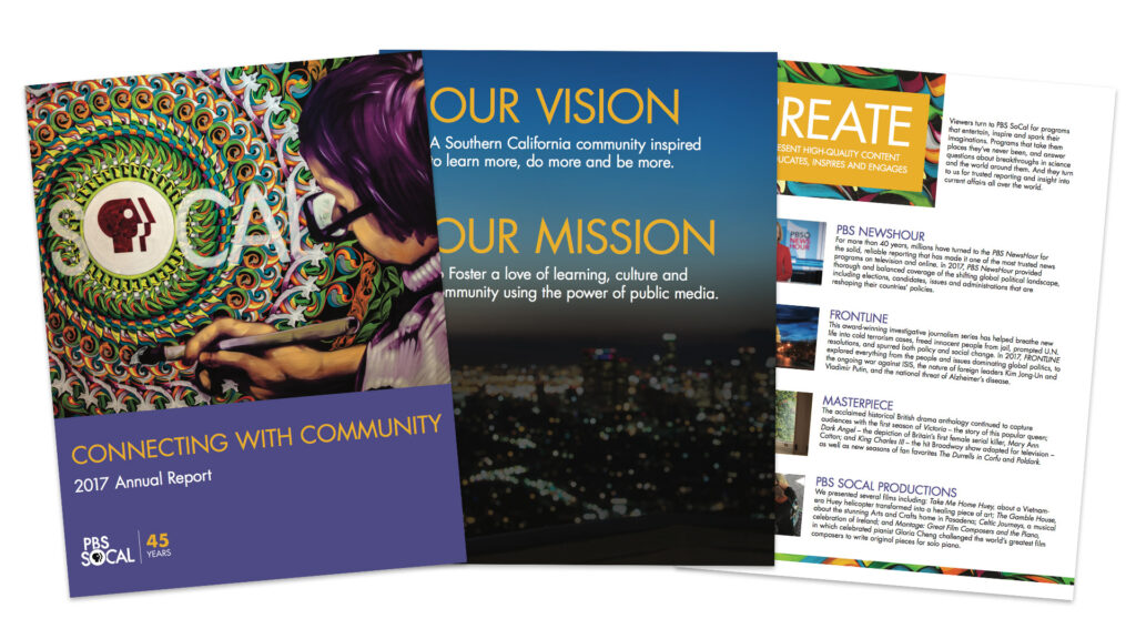
If you want to see more, feel free to peruse our Web Design and Print & Digital Design work here.
Counter(intuity)culture
It’s important to us that our clients feel welcome when they walk through our doors – and that starts with the state of our company culture. We met with outside consultants to help us fine-tune our goals, review our foundation, and develop our core values.
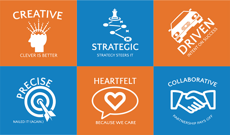
We’re feeling pretty proud of what we’ve created, excited for the future, and grateful for our happy clients.
Not one of them just yet? Get in touch – we’d love to hear from you!

