
The basics for every website start with choosing a color combination that works with what you are trying to sell or market. Choosing the right color scheme can be crucial to selling a product, as you don’t want the buyer to get turned off and not make a purchase.
When choosing a color combination for your website, you should refer to a color wheel, available online or at any art store. Graphic designers live and die by this color wheel. As you can see below, the color wheel splits into two equal sections: warm colors and cool colors.
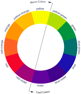
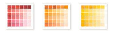
Warm colors are based on reds, oranges and yellows:
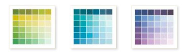
Cool colors are based on greens, blues and purples:
Exploring warm vs. cool colors for your website is important. When choosing colors, keep in mind that cool colors recede and warm colors advance. Depending on the color scheme you choose, your website will give the viewer different feelings, such as calming (warm) or refreshing (cool). Remember that the human eye is immediately drawn towards bright, warm colors and white.
Warm color palette:
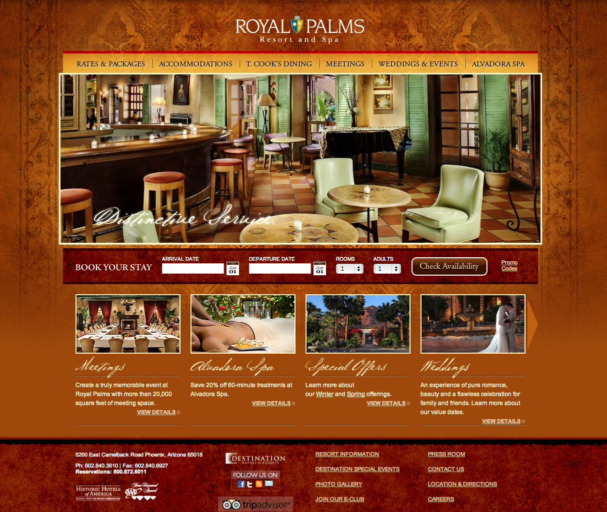
The Royal Palms color scheme makes the viewer feel warm, cozy, and comfortable.
Cool color palette:
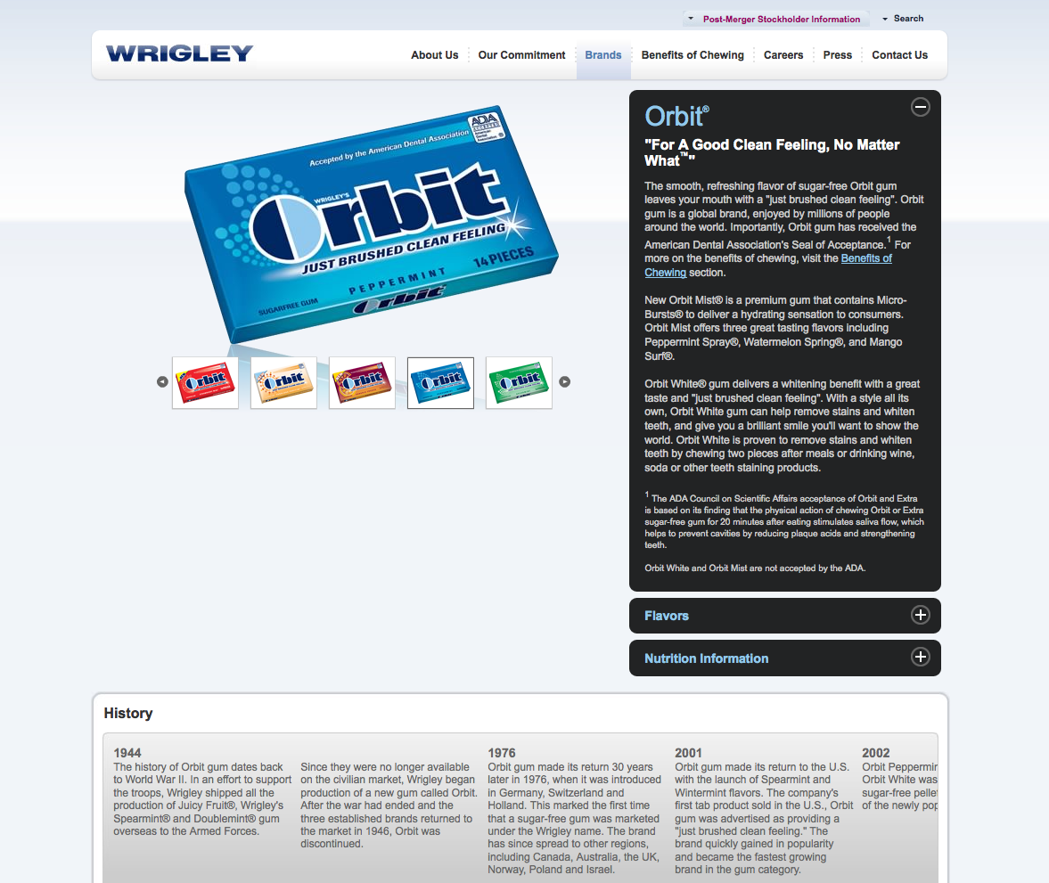
Wrigley’s color scheme provides the feeling of cool, fresh and clean.
For a dramatic and eye-catching effect, you can mix the two color palettes. Using two complementary colors—those that are immediately opposite one another on the wheel—invokes more than one emotion from your viewers.
For example:

Betty Crocker uses different shades of cool blue as the background, and a very powerful warm red as the foreground. The viewer is drawn to the red links and buttons, which helps navigate through the site in the manner intended by the company.
Another contrasting yet user-friendly color palette is green and orange. Notice how the green relaxes and recedes. The vibrant orange pops.
Start your website palette with the color or color combo of your logo. To make the site visually stimulating and flowing, use no more than two colors (although you can use different shades of those colors) plus white and black.
By using color to influence your viewers, you have the power to guide what your visitors see first and how they navigate your site.