
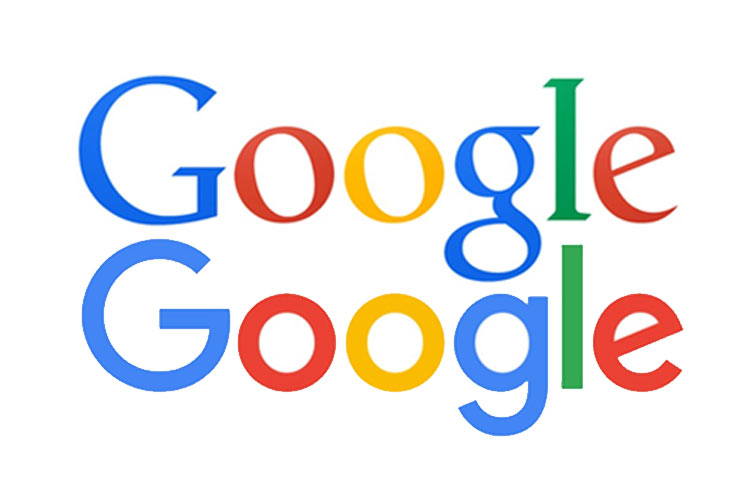
Okay, guys. Big news. Google has changed its logo.
Yes, Google temporarily alters its logo for special occasions and holidays, but the latest sans-serif modification is its biggest change in 16 years – and it’ll be sticking around for the foreseeable future.
While it might seem…dare we say it…counterintuitive for a company to mess with its beloved logo, when done properly it can be a great way to revitalize a tried-and-true trademark. What makes Google so impressive is that even with an obvious change in typeface, its logo is still instantly recognizable. You see those colors and you think Google. You just do. Now that is successful branding.
Keep in mind that a good logo should be:
- Simple. Clean lines, a pleasant color palette, and a good name go a long way.
- Timeless. You want your logo to last. Steer clear of anything too trendy – it’s likely to look outdated sooner.
- Accessible. A logo needs to fit in lots of different spaces and be usable for many different purposes.
Becoming a household name is something many companies strive for and few accomplish. But with a memorable logo and proper marketing, Google-like status might not be as far out of reach as it seems.
What do you think of Google’s new get-up? Let us know in the comments below!